Visualise sequential distributions using a range of plotting styles. Sequential distribution data can be input as either simulations or values corresponding to percentiles over time. Plots are added to existing graphic devices using the fan function. Users can choose from four different styles, including fan chart type plots, where a set of coloured polygon, with shadings corresponding to the percentile values are layered to represent different uncertainty levels.
See the pkgdown site for full details.
ggplot
The plotting functions in fanplot was designed for working with graphics in base R. Jason Hilton has since developed the excellent ggfan package for creating fan charts in ggplot2.
Installation
You can install the released version of fanplot from CRAN with:
install.packages("fanplot")And the development version from GitHub with:
# install.packages("devtools")
devtools::install_github("guyabel/fanplot")
Example
library(fanplot)

# empty plot
plot(NULL, xlim = c(1, 945), ylim = range(th.mcmc)*0.85, ylab = "Volatility")

# add fan
fan(th.mcmc)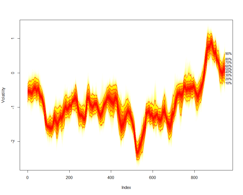
Article
Read more about the fanplot package in the R Journal article